Details of the Economic Calendar on November 28
Data on House Price Index in the United States was released, reflecting a 0.4% increase (month over month). Considering the significant decrease in sales volume, especially in the secondary market, the price increase is viewed more as a negative factor, hindering the real estate market's recovery. According to the data received, a subsequent weakening of the U.S. dollar becomes a logical outcome.
Analysis of Trading Charts from November 28
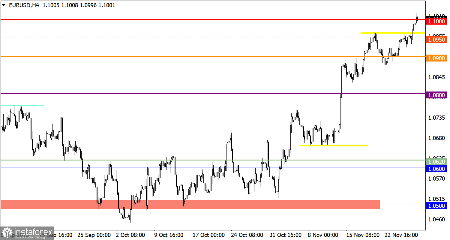
The EUR/USD currency pair reached a local high in the upward cycle. Quotes rose above 1.1000, indicating a high interest of traders in the upward movement.
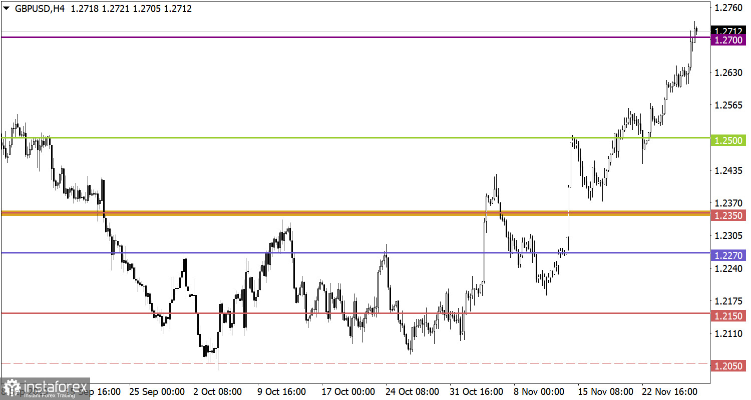
In the GBP/USD pair, momentum led to the breakout of the 1.2700 mark. This event generates a technical signal of the pound's recovery relative to the decline observed from July to September.

Economic Calendar on November 29
Today, the second estimate of the U.S. GDP is expected to be published, which ideally should confirm the first estimate already priced in by the market. However, if the data differs, speculative jumps in the market may occur.
At the moment, forecasts indicate that the second estimate will simply confirm the first.
EUR/USD Trading Plan for November 29
It is expected that the subsequent increase in the volume of long positions on the euro will occur if the price is maintained above the level of 1.1050. This may lead to a rebound of more than 70% relative to the decline from September, indicating a high chance of updating the local high of the upward trend. As for the technical signal of the euro being overbought, it undoubtedly exists in the market, and we may soon see a stage of trade force regrouping, expressed as a pullback.

GBP/USD Trading Plan for November 29
In the case of price stabilization above the level of 1.2700, a subsequent increase in the cost of the pound sterling towards 1.2800–1.2850 is possible. However, one should already be prepared for the appearance of a technical pullback in the market due to the growing overbought status of the pound sterling.

What's on the charts
The candlestick chart type is white and black graphic rectangles with lines above and below. With a detailed analysis of each individual candle, you can see its characteristics relative to a particular time frame: opening price, closing price, intraday high and low.
Horizontal levels are price coordinates, relative to which a price may stop or reverse its trajectory. In the market, these levels are called support and resistance.
Circles and rectangles are highlighted examples where the price reversed in history. This color highlighting indicates horizontal lines that may put pressure on the asset's price in the future.
The up/down arrows are landmarks of the possible price direction in the future.


