FX.co ★ Evolution of chess design through centuries


Evolution of chess design through centuries
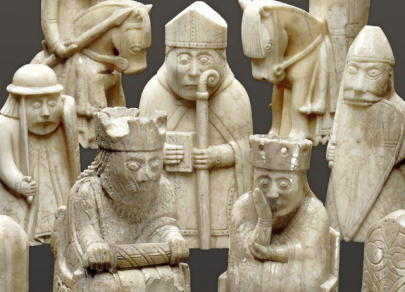
Lewis Island chess —medieval gaze
Scholars date these chess pieces to the twelfth century. They were found in Scotland in the nineteenth century and are carved from walrus ivory and whale tooth. They are famous for their incredibly expressive, comically anxious faces. Queens clutch their heads, and rooks depicted as berserkers gnaw their shields. These are not mere game tokens but distinctive sculptures that convey the harsh spirit of the Viking era. They remind us that chess originally dramatized real war and feudal hierarchy.
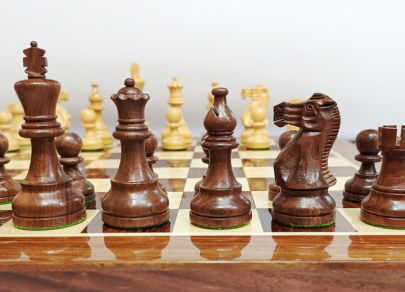
Staunton —birth of standard
In 1849, Nathaniel Cook developed a design that became the gold standard for tournaments worldwide. Before that, hundreds of styles were in use, confusing players. The Staunton design is the apex of Victorian functionalism: pieces are easily distinguishable, stable thanks to wide bases, and the symbols are clear (a cross‑topped crown for the king and a coronet for the queen). It is the “Helvetica” of the chess world — a design so perfect that we stopped noticing it and took it as the only correct form.
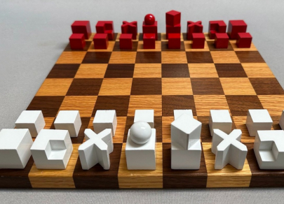
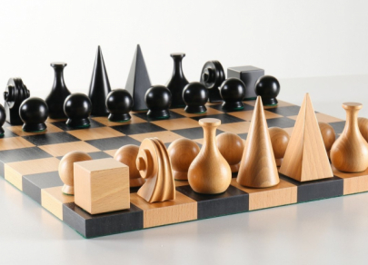
Bauhaus (Josef Hartwig) — form follows function
In 1923, Josef Hartwig of the Bauhaus school radically rethought chess. He abandoned figurative representation (horses, kings) in favor of pure geometry. The shape of each piece is dictated by how it moves on the board. The bishop is rendered as the letter X, the rook as a massive cube, and the pawn as a simple cube. That set became a manifesto of modernism, where design sheds historical baggage and must be strictly logical. Such a set turns the game into an abstraction of movement.
Man Ray — surreal geometry
Dadaist and surrealist Man Ray created his set in the 1920s, playing with simple shapes and symbols. His pieces are neither people nor abstract move icons but poetic objects. The king takes the form of an Egyptian pyramid, while the knight echoes the scroll of a violin’s headstock as a nod to a musician friend. Man Ray turned the chessboard into a surreal landscape in which familiar objects change meaning, producing at once the atmosphere of a dream and of an intellectual duel.
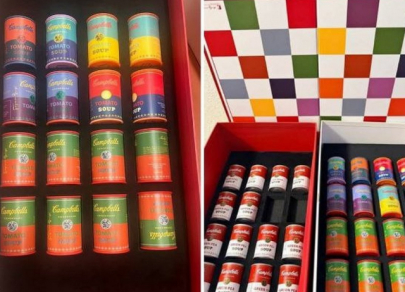
Andy Warhol — pop art on chessboard
Andy Warhol, king of pop art, could not ignore chess. In his versions, he used ready-made principles and commercial aesthetics. In one variant, the pieces were Campbell’s soup cans of different sizes or colors, turning an intellectual duel into an ironic collision of brands on a supermarket shelf. Other versions employed bright, acidic colors and repeatable images. Warhol’s chess sets desacralize the game, turning an elite object into an element of mass consumer culture.
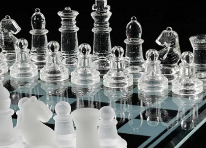
Transparent chess by Nendo —disappearance of matter
Contemporary design moves toward dematerialization. Japanese studio Nendo created a minimalist set in which the white pieces are cast from transparent acrylic and the black pieces from matte material. The shapes are barely sketched. It is a game of light and shadow, where the pieces seem to dissolve into air, leaving only pure strategy. That design reflects the digital era, where physical presence becomes less essential and invisible connections and possibilities matter most.
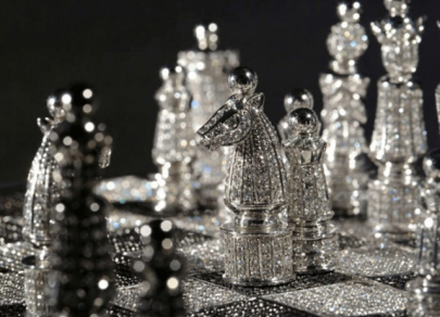
Pearl Royale and Jewel Royale — chess as treasury
There are sets whose price is counted in millions of dollars. The best known is Pearl Royale, created by Australian jeweler Colin Burns. The pieces are cast in 18‑carat white gold and set with more than 500 sapphires and 500 diamonds, and their crowns are topped with rare South Sea pearls. Another example is the Royal Diamond Chess set by Charles Hollander, made from 14‑carat white gold and nearly 10,000 black and white diamonds. Here, the game recedes to second place. These are “chess‑safes,” symbols of absolute power and wealth in which a single pawn can cost as much as a luxury car.