FX.co ★ World’s most expensive logos


World’s most expensive logos
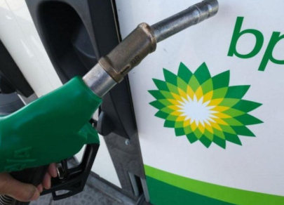
1st place – British Petroleum
The logo of British Petroleum (BP), an oil and gas company, is the world’s most expensive one. Its design and promotion cost the company a whopping $210 million. The green-and-yellow Helios logo was introduced in 2000. The design of the logo symbolized BP's environmental ambitions. However, Greenpeace activists scoffed at the idea and put the oil giant in a bad light. The reputation of British Petroleum’s logo especially suffered, following a major oil spill in the Gulf of Mexico, which occurred at the company’s fault. Back then, the Internet was full of memes depicting the Helios logo covered in oil.
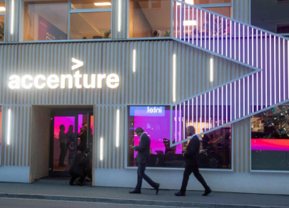
2nd place – Accenture
Accenture is one of the world’s largest consulting companies headquartered in Ireland. Until 2001, it was known as Andersen Consulting. The firm not only re-named itself but embarked on a brand refresh. To highlight Accenture's commitment to technology innovation, a new logo was created. It depicts an arrow pointing to the right. Despite its simple design, the logo cost the company as much as $100 million.
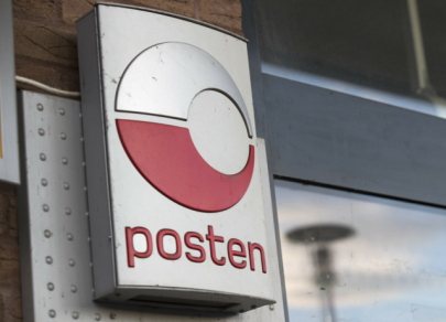
3rd place – Posten Norge
The national postal operator of Norway, Posten Norge, launched a massive rebranding campaign in 2008, including an entirely new logo. The symbol was designed in the company’s corporate colors (red and gray). The new logo has the shape of a sphere, which emphasizes the postal operator’s global appeal, according to the marketers. It cost Posten Norge $55 million.
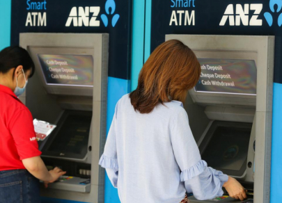
4th place – Australia and New Zealand Banking Group
When the Australian and New Zealand banking corporations merged into a single financial group, the ANZ, they needed a common logo, which took 18 months to design. The bank paid $15 million for its joint symbol resembling a human figure. This way, marketers wanted to emphasize the company's customer-oriented approach.
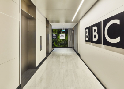
5th place – BBC
Perhaps one of the most recognized logos in the world belongs to the British Broadcasting Corporation (BBC). The brand uses white capital letters in black square boxes. The media giant paid $1.8 million for this logo in 1997. The BBC symbol remained unchanged until recently. The company decided to simplify it a little last year and spent several thousand dollars on rebranding. However, the fundamental difference between the old and new logos can hardly be noticed.
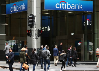
6th place – CitiBank
This American bank also has one of the most expensive logos in the world. The logo depicting a red umbrella over the word “City” was created by designer Paula Scher from Pentagram. It symbolizes account security and customer protection. Interestingly, it took the designer just 5 minutes to create. The sketch was made on a paper napkin. The bank refused to pay a high price for such a simple design at first. However, it had to eventually give in and pay $1.5 million for its new logo.
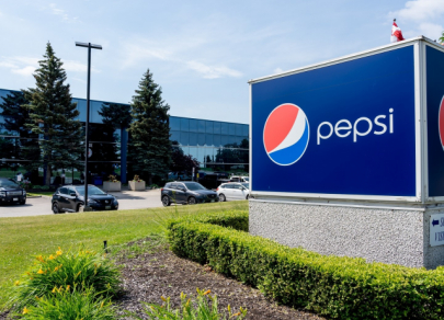
7th place – Pepsi
In order to stand out in a market dominated by Coca-Cola for years, its age-old rival Pepsi was willing to pay any price for an eye-catching logo. In 2008, the company spent $1 million on a logo with a red, white, and blue design in a sphere-like shape. Although the new symbol was in line with the latest design trends, Pepsi still was unable to outshine Coca-Cola, which remained the industry leader.