FX.co ★ Back to Pleasantville — why world agrees to monochrome?


Back to Pleasantville — why world agrees to monochrome?
Clothing —triumph of achromatic uniformity
Look at a crowd on the subway or a busy street and you will see a sea of black, gray, navy, and beige. In recent decades, fashion has moved persistently toward visual asceticism. Fast fashion produces millions of basic items in neutral tones because they are easier to sell and to match. Bright colors are read either as childishness or as a loud plea for attention. We camouflage ourselves into the background by choosing the psychological safety of achromatism. Clothing has stopped being a way to announce identity — it is now a way to blend into the masses and hide.

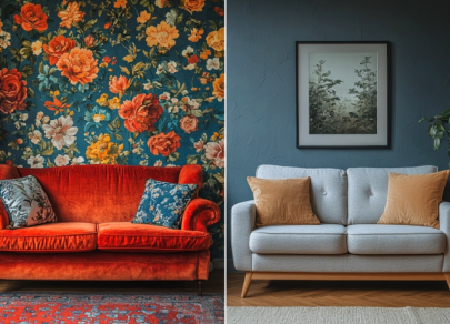
Interiors —dictatorship of beige Scandi
Walk into a popular furniture store or scroll through interior designer accounts and you will drown in “Scandinavian minimalism” that has mutated into a sterile desert of white walls, gray sofas, and beige rugs. The trend is justified as a search for calm and “cleanliness,” but often it masks a fear of making a wrong palette choice. A neutral interior is safe: it is easy to resell, and it will not tire. As a result, we live in spaces stripped of emotional anchors that resemble hotel rooms more than homes with a unique history.
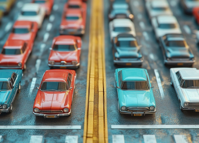
Cars —conveyor of gray shadows
The statistics are ruthless: roughly 80% of new cars rolling off assembly lines worldwide are painted white, black, gray, or silver. Roads once sparkled with turquoise, cherry, orange, and green cars. Manufacturers justify the shift by saying neutral colors retain the highest resale value. Rationality has triumphed over aesthetics. We buy a dull gray car not because we like it but because it will be easier to sell to the next owner, who will likely choose another dull gray car.
Architecture — monotony of concrete and glass
Modern megacities increasingly look like one another, turning into clusters of glass towers and gray concrete facades. Historic architecture that used local-colored materials—red brick, yellow sandstone, colored plaster—yields to a global international style. It is technological and efficient, but visually dead. Using bright color on a modern facade is treated as an architectural risk or a piece of kitsch. The world loses its color ties to places. Cities are becoming monotonous backdrops for digital screens.

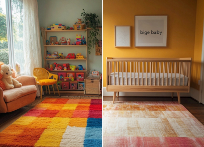
Children’s toys —sad beige baby
Even childhood, traditionally a bastion of loud, saturated color, has come under the attack of monochrome. There is an ironic term, “sad beige baby,” to describe the trend for aesthetic, wooden, muted pastel toys and clothing. Parents, obsessed with creating the perfect Instagram aesthetic, choose toys that fit their neutral interiors rather than toys that stimulate a child’s brain according to scientific theories of color perception.
Branding and logos — flattened to black and white
A global simplification and desaturation of brand visual identities is underway. Major companies — from automotive giants (BMW, Audi, Renault) to fashion houses (Burberry, Saint Laurent, Zara) — are rebranding, dropping three‑dimensional, colorful logos in favor of flat, black‑and‑white, minimalist marks. The phenomenon has a name: “blanding” (from the English word "bland"—tasteless, insipid). The result is visual leveling in the competitive field: the world of brands becomes an endless column of identical, sterile black‑and‑white symbols.
Art and photography — desaturation filters
Even the way we see and capture the world has shifted under the pressure of monochrome fashion. Popular presets and filters in photo apps (for example, VSCO or Instagram) often aim to “subdue” colors, reduce saturation, and make images more “atmospheric” by shifting them toward gray or beige. We train our eye to find beauty in the absence of color, treating saturated reality as vulgar or too tiring to perceive. Life through a preset becomes more desirable than life in full color.

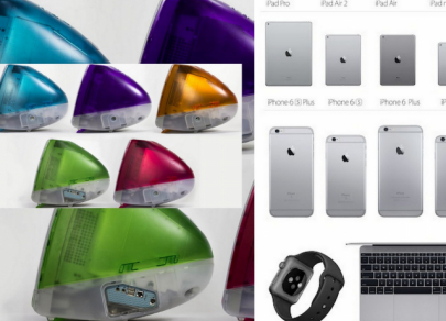
Technology and gadgets —cold of metal and plastic
Remember the era of the iMac G3 with its translucent bodies in every color of the rainbow or the multicolored Nokia phones? Today, the gadget world is a realm of anodized aluminum space grey, black glass, and white plastic. Manufacturers are afraid to experiment with color, fearing it will narrow the buyer base or look “cheap.” Technologies that should brighten our lives physically look like cold, emotionless monoliths, emphasizing our growing dependence on screens rather than on the material world.