Details of the Economic Calendar on November 8
The volume of retail sales in the EU decreased by 0.3% on a monthly basis and by 2.9% annually in September. Based on the available macroeconomic data, it can be assumed that the European Union is steadily sliding into a recession.
Analysis of Trading Charts from November 8
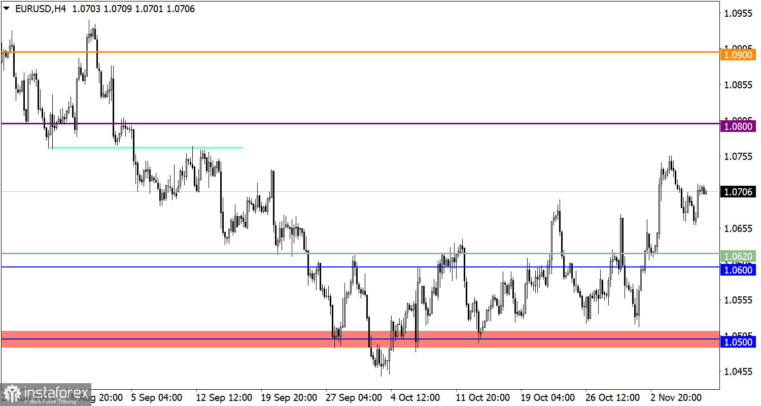
The EUR/USD currency pair locally displayed an upward trend, leading to a reversal above the 1.0700 mark.
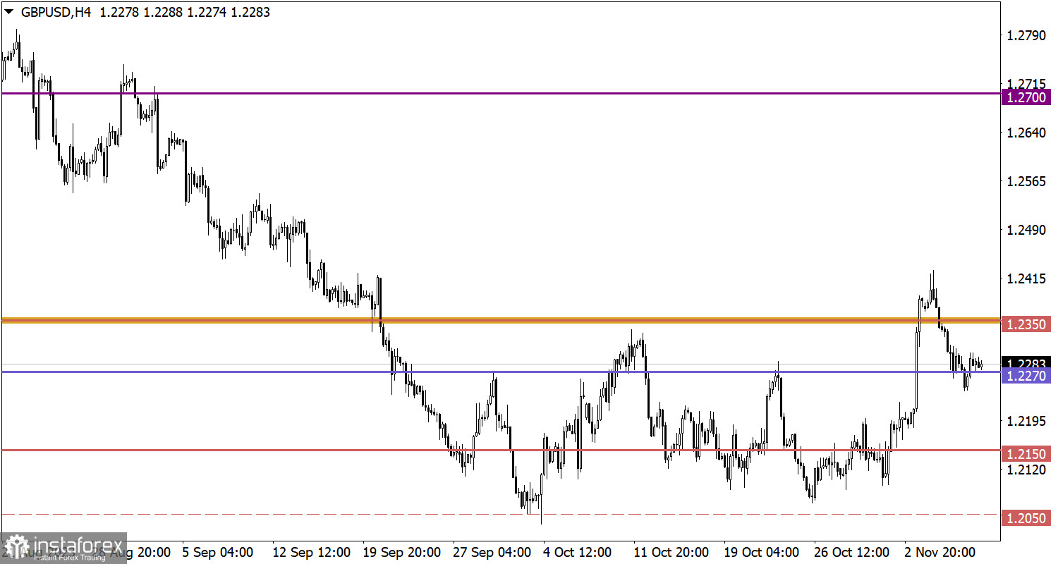
The GBP/USD pair partially regained positions relative to the recent decline. As a result, the quote returned above the 1.2270 mark, while the overall downward trend persists in the market.

Economic Calendar on November 9
Today, data on U.S. jobless claims is expected, with an expected overall increase in their forecasted figure. Details of statistical data indicate that the volume of continuing claims may rise from 1.818 million to 1.820 million, and the volume of initial claims may rise from 217k to 218k.
Time targeting:
U.S. Jobless Claims – 13:30 UTC
EUR/USD Trading Plan for November 9
In this case, there is a recovery in the euro's exchange rate of about half relative to the recent decline, but radical changes are still not observed. The control levels are 1.0650 and 1.0750. Maintaining the price beyond one of these levels could indicate a subsequent price move with possible speculative jumps.

GBP/USD Trading Plan for November 9
For a subsequent downward turn in the pound's exchange rate, stabilization of the price below the 1.2270 level is required. In this case, movement towards 1.2200 is possible.
Traders will consider an the upward scenario if the area around the 1.2270 level serves as support and the quote rises above the 1.2300 mark.

What's on the charts
The candlestick chart type is white and black graphic rectangles with lines above and below. With a detailed analysis of each individual candle, you can see its characteristics relative to a particular time frame: opening price, closing price, intraday high and low.
Horizontal levels are price coordinates, relative to which a price may stop or reverse its trajectory. In the market, these levels are called support and resistance.
Circles and rectangles are highlighted examples where the price reversed in history. This color highlighting indicates horizontal lines that may put pressure on the asset's price in the future.
The up/down arrows are landmarks of the possible price direction in the future.


